A New Life in Seattle

A New Life in Seattle
August, 2018

Sunday, September 25, 2016

Business Cards 3: Two-siders--Side A

A two-sided business card gives you the chance to make your case and to strut your stuff creatively. But you'd be wrong to think that the front and the back are two different affairs--or that the front is your carte blanche to say anything that gets attention. (As in Now that I've got your attention...)

I say see the front side as your opportunity to shine your light on the back.  Here are two examples that show what I'm getting at.

The wrong way:


If you Google, you'll see that there's nothing distinctive about this: there are scads of links to this same I'll shoot you style of card. And you don't really need to see the back to know that this common cop-out shock effect represents unoriginal work, lacking depth and confidence. Deleting the Don'rt worry line does nothing to improve it: clearly, what the photographer wants isn't to shock us but to get a hug. 

The right ways:

1) The design suggests the artist's style or spirit. 


This is distinctive, tasteful and classy. And if it represents the designer's work, then I know what I'm getting--and I already want it. I'm eager to turn the card over for further contact information or key selling points.


2) The front design is seriously clever.


We may in the past have been put off Yoga because we think of it as painful or boring. Yet we know it could be good for us. This card is far beyond cute in the 'I'll shoot you' way. This is seriously clever because it suggests that this place would be fun. Yoga made less painful and more the masses. I want to see their contact information so I can give them a call.

3) The front design gives us a sample.


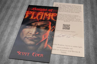
This card takes us in a useful direction for writers. I scrolled hundreds of author business cards, most wasting precious space by listing the name as both 'author' and 'writer', with phone and other contact information, maybe a boilerplate image of a typewriter as well. Here the author has given the front side to his book cover, sure to appeal to fantasy readers. Another author might choose to show his cover and a very brief quote from the book. Still another might actually offer a short sample of his prose. In all cases, the back side is reserved for contact and author information, After you've captured our interest, that's stuff we might like to know. Only then.

We'll cover the back side next week. For now, in summary:

1) Two-sided cards are most useful for those who aren't quite There yet. 
2) If we aren't There, then our names and phone numbers don't mean a thing to anyone.
3) Avoid the cutesies at all cost and offer compelling instead.
4) Your card not about you, its's for us--and what can you offer that others cannot.
5) The front of the card exists to compel us to turn the card over,
6) The back of the card exists to convince us that you are the bomb. 
7) The two sides add up to one--as in you're the one for me. 


Sunday, September 18, 2016

Business Cards 2: The Front Side Only Sort

Only one side of a card is required if people actually want it. And they may want it for various reasons.

Your name and/or your position


All three of these are fine. I warm most to the attitude of the first and the simple gravitas of the third. But the cards provide the contact information that the recipients crave. We don't need to know the names of Arnold's movies. Of the three examples, more is only more with the cheeky attitude displayed in the first. That comes across as something like the soul of Facebook. And if Obama's card looks too cluttered, remember this: he was trying to convey complete accessibility.


Your service


Look closely and you'll see the perforated line down the center. Contact info on both halves. A tearable divorce lawyer card is more than simply clever. It tells us how this lawyer works. The steadfast, conventional lettering conveys professionalism and reliability. And the ingenious tear design tell us this lawyer knows how to think outside the box as well. 

Your experience

Your other major selling point may be the breadth of your experience:
--Twenty years' experience
--99% acquittal rate
--Formatter/editor of 700 books
--First agent of Lady Gaga

Whether you show at a courtroom or an accident site or a literary convention, your card will open many doors if you're a proven pro.

                                                                       *****

But what about the rest of us?

Sad to say, when we're just starting out next to no one really needs us. Or at least they don't know that they do yet. Our names are unknown. We lack movie star mugs. Half the seats in our new indie business are empty at all times. Or we find ourselves desperately struggling to stand out in a wilderness of signs.

If your card tries too hard or it's cluttered...you're toast.
If it fails to at least suggest a compelling Reason Why...you're toast.
If it lacks pizzazz and personality...you're toast.
If it fails to give contact info...you're similarly toast.

No need to despair, though. A two-sided card can help you reach the high plateau where only a one-sided card is required.

Consider this yoga studio card, whose contact info's on the back:


Till next week.

This is my report.


Sunday, September 11, 2016

Business Cards: Show-Wins, No-Wins & Show-Loses

This is the first in a series of posts about a new subject close to my heart as I prepare to order a batch of business cards.


As we go, I'll explore why my last card failed years ago...and what goes into a great card. But let's keep these posts short and simple, easy to digest. There are so many things to consider--from card stock quality to finish to layout to fiendishly difficult copy--that today we'll start with just three basics. Here are the cardinal No-Win, Show-Win and Show-Lose rules.


The No-Win Cardinal Rule

You must have a great business card that represents you and your work. Your situation is No-Win without one. You have too many rivals, all screaming for sales and all handing out their cards. Professionals have business cards. We don't patronize losers who scribble their names and phone numbers on napkins. You're in a wilderness of signs and you will sink without a sound unless you heed this first Cardinal Rule. You don't need just a card but a great card that generates interest and heat...gives a sense of who you are and why you are different...and makes it easy to check out your work.

Accept this first rule and you're set to proceed. Go with no card or cheap card or amateur card...and you'll weep as you listen to this guy:


The Show-Win Cardinal Rule

In most places the next advice would be served as the finale. But it's something you should be thinking about from the get-go, from the very first thoughts of your card:

The way that you'll present your card is part and parcel of the show. If you've got a gold Cadillac among cards, you still won't get much mileage if you have to fumble to find it...or pull a battered specimen from your shirt pocket or purse. If your card is the winner it must be, then present it with casual, confident flair that people are sure to remember.


Easy does it, though. Beware of seeming to strain for the high notes. I once knew an artist who handed out cards as if they were hosts at a Catholic mass. First came the pricey card case which he delicately opened. Then he held the case in both hands with a reverential look. Within the opened case you saw different versions of his card, each with a different photo. And you were invited to take one...his eyes saying to swallow it whole but don't chew.

A more offhanded manner and an engaging 'Help yourself' would have turned that scene around


The Show-Lose Cardinal Rule

You must know your core card audience. Handing out your business card is a form of direct mail. In a blind direct mail campaign--e.g., sending Tweets to all your followers--the 'conversion rate', the percentage of those who will actually buy, is said to run somewhere from one to five percent. You can certainly better your chances with a terrific business card and a dynamite presentation.

But let's repeat: know your core card audience. Many people love collecting cards or are too shy to refuse one. By and large, you'll be wasting your money handing your cards out at random. Worse, you'll be wasting both money and time, if you're an ebook writer, debating with paper book snobs.

One final form of Show-Losing: if you have produced a classic card or have a cool, unique campaign, overcome the temptation to share it online. For pirates sail among us. And those who'd gladly sit on deck and watch you drown will plunder you without any sign of remorse.

Screw the pirates.


And know who your real friends are.

That's it for now. See you next week with further thoughts on business cards.


Sunday, September 4, 2016

How to Properly, Pefectly Stuff It

Odds are, when you think about stuffing, you think about this:

Image result for stuffing it images


Or perhaps to cruder forms of stuffing whose pictures we'd better not share.

Today, though, my thoughts turned to what may seem to be the dullest of stuffings on earth:


 Let's begin with a couple of questions:
1) How many envelopes have you stuffed in your life?
2) How often have you considered the quality of the envelope?

As for me, I've stuffed tens of thousands, the great bulk related to writing but scores of personal and professional letters, as well as the paying of bills, etc. I'd give myself a passing grade on most of the paper I've used. But envelopes? Ummmm, not really.Got to cut corners somewhere, I thought.

But yesterday I needed envelopes for a 4x6 postcard photo to be send to a select group of 50. I'd spent months getting into shape, hired a terrific photographer and been through an exhausting photo shoot. We'd ordered double-sided cards from VistaPrint. And now at last. we were ready to go. Except for the envelopes. And I knew where to get them cheap.

Sure enough, Office Depot was running a sale on 6x9 tan envelopes. 50 marked down to only $4.99!  But my eye kept turning to the white photo envelopes designed for 4x6 photos. I liked the color...the size made sense to me--in a larger envelope, my card would be jostled about, maybe bent...But $15.99 plus tax? About $.35 an envelope?

Luckily, the inner voice I sometimes call The Voice went off: Are your friends and are your card not worth a mere $.35? Do you want to show up in their mailboxes in a beautiful shirt beneath a threadbare coat?'

I understand, I told The Voice. The impression that we make is made up of so many things. And our attitude toward ourselves, our work and others is expressed in the choices we make. Consistency is the great master key: I don't think I'd want to do business with someone who sent me a letter on gorgeous stationery, but filled with typos and food stains...and sent in a cheap envelope. Be one thing or the other: a class act or a schlub.

The Voice answered, 'You go, babe.'